Problem Statement
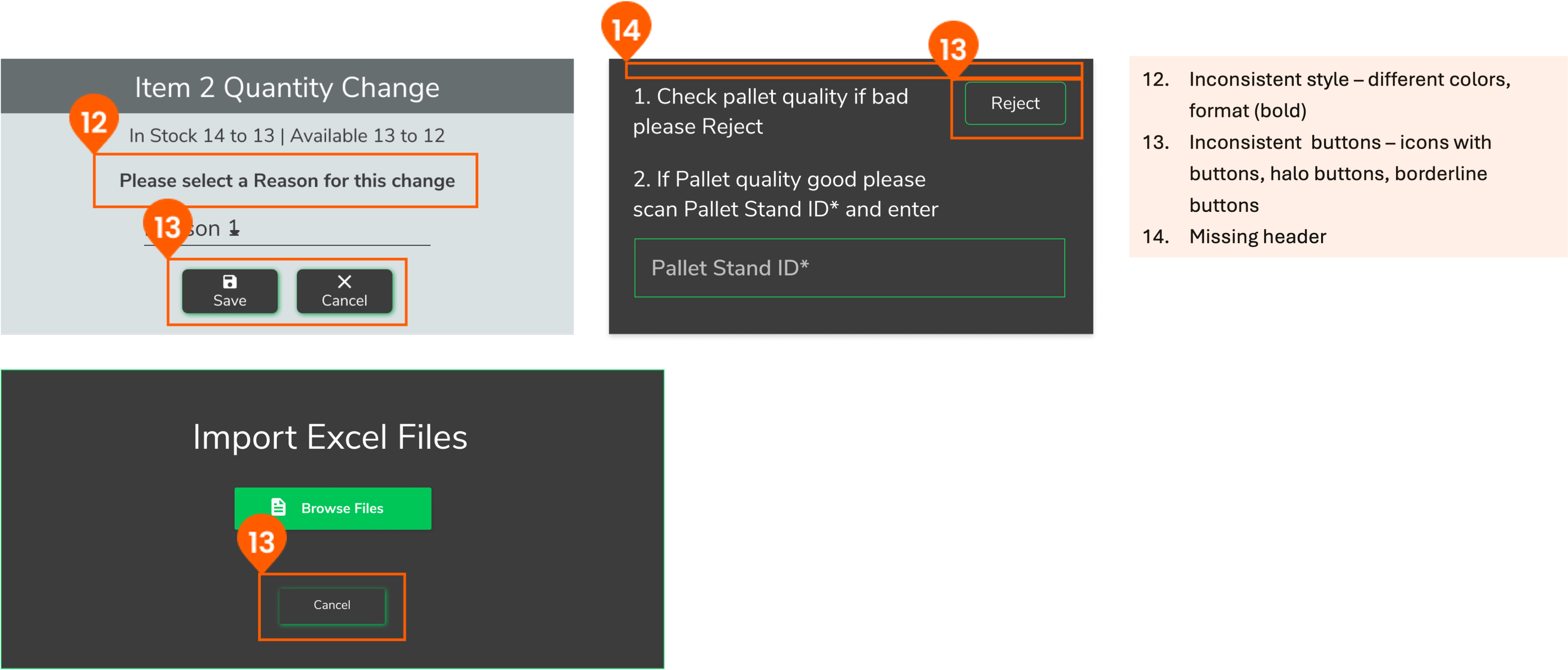
Before implementing a design system, our product suffered from UI inconsistencies, totally different color system in dark/light modes, accessibility issues, and inefficiencies (1) in design and development. The absence of standardized components led to:
- 1. Developers recreating similar components multiple times.
- 2. Frequent back-and-forth between designers and developers to clarify colors and component states.
- 3. Increased debugging efforts due to inconsistent implementation.
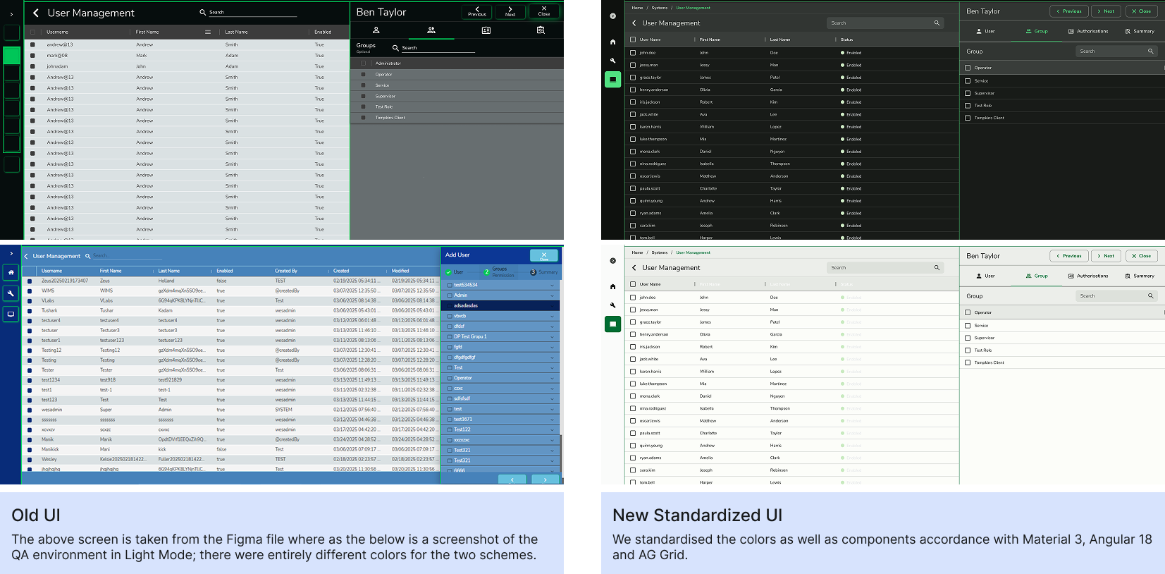
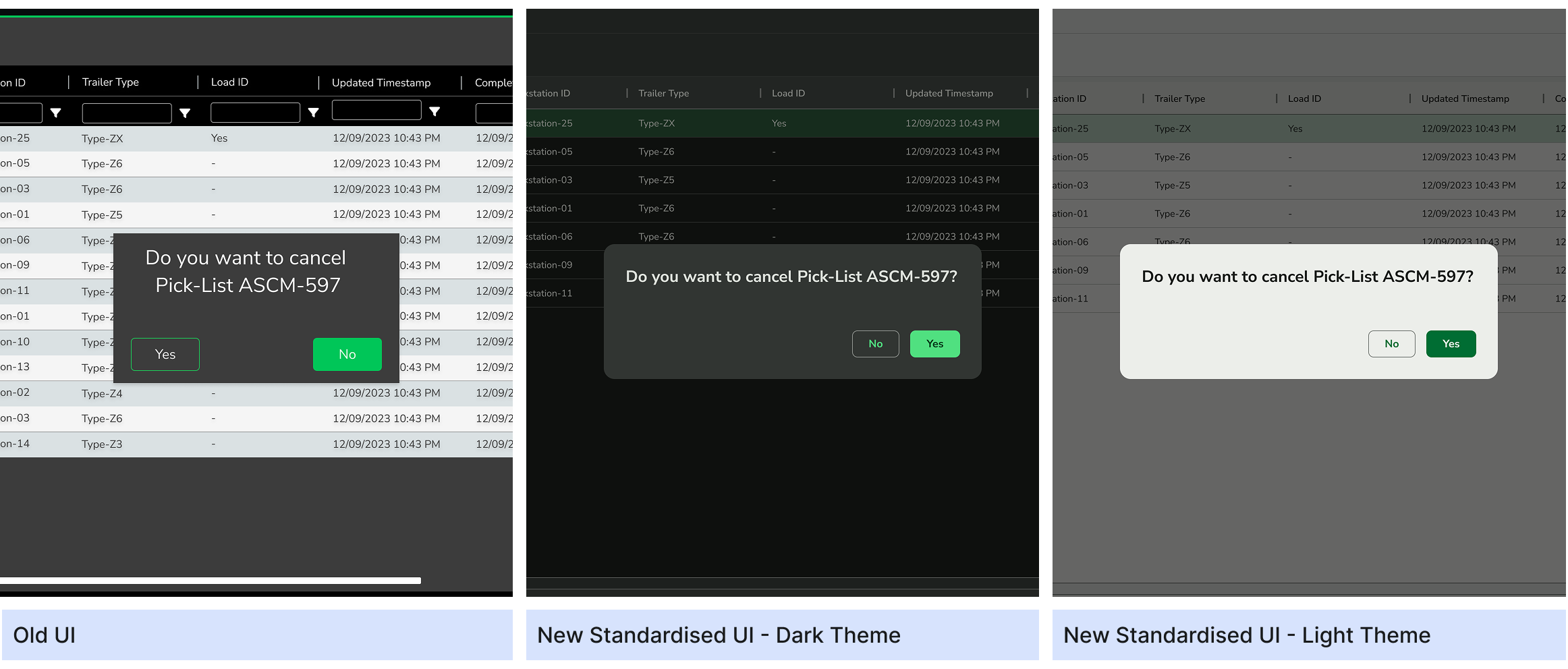
We performed a heuristic analysis that highlighted these inconsistencies and shared our findings with stakeholders. This analysis, combined with before-and-after visual comparisons, demonstrated the need for a unified design system.
Impact
Initially, stakeholders were hesitant to invest in a design system because there was no drastic visual change. To shift the conversation, we focused on efficiency gains and measurable impact:
- 1. Upfront Component Creation – Developers now build reusable components first, rather than designing screens individually, streamlining the development process.
- 2. Standardized Colors – Eliminated the need to manually check and reassign colors for each screen.
- 3. Time Savings – Screen development time was reduced by 50%, and when factoring in the effort to create reusable components, we estimated an overall 20% reduction in development time by minimizing context switching.
- 4. Simplified Debugging – Components and colors can now be edited from a single source, reducing errors and rework.
The Team
Design Team - 1 Interaction Designer (Me), 1 Visual Designer
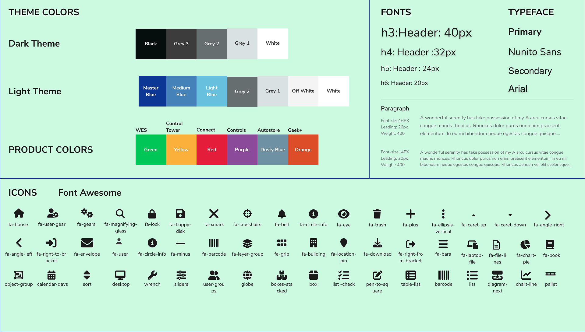
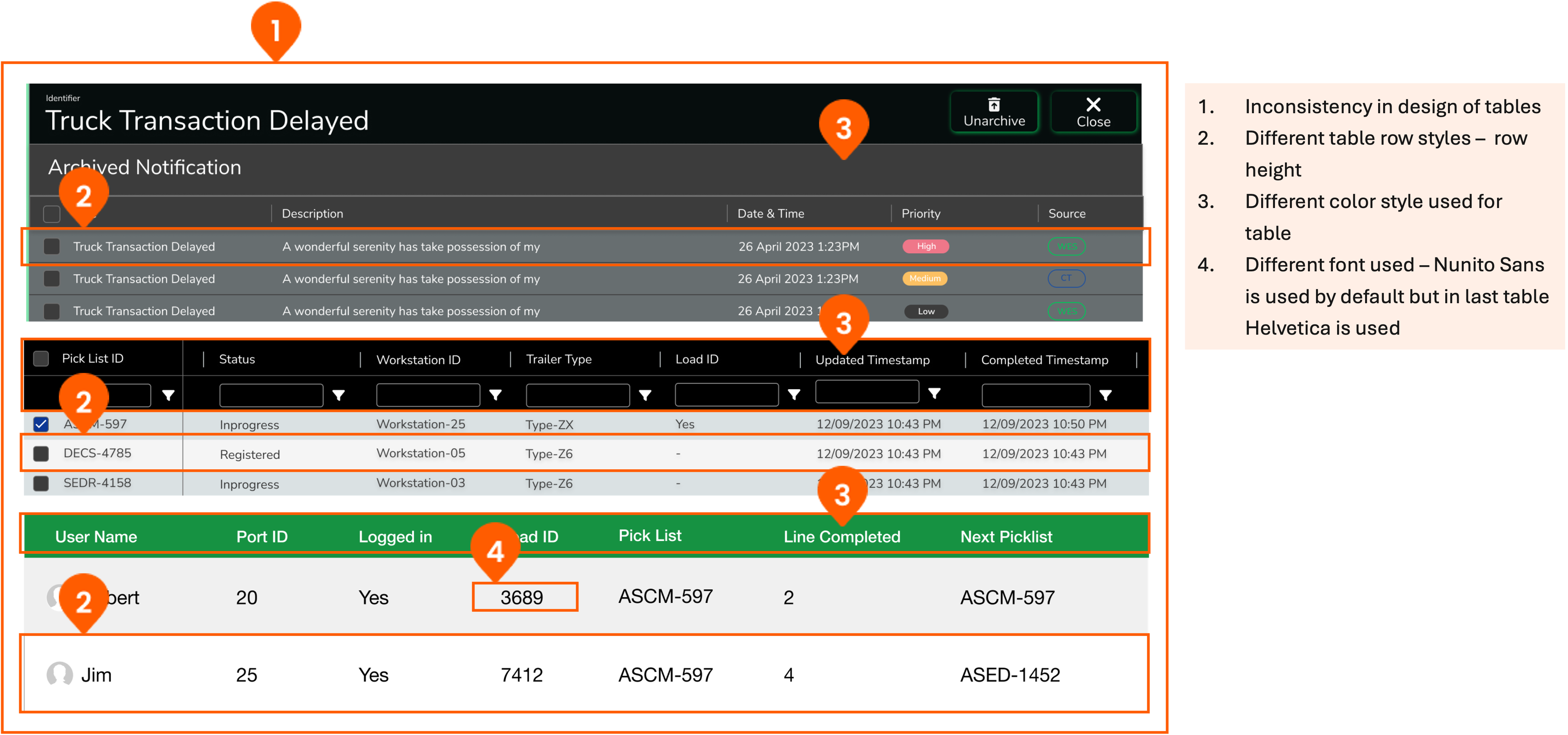
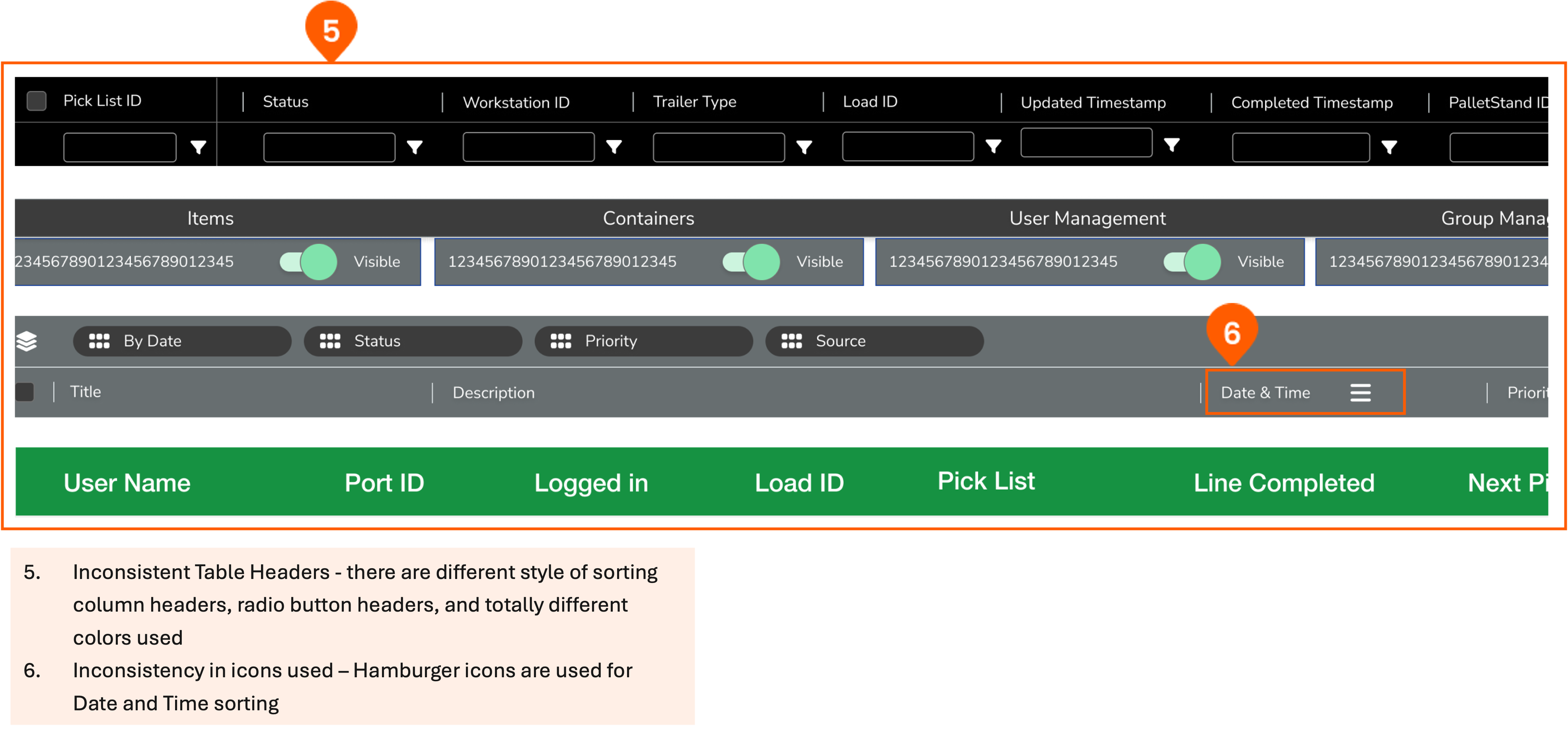
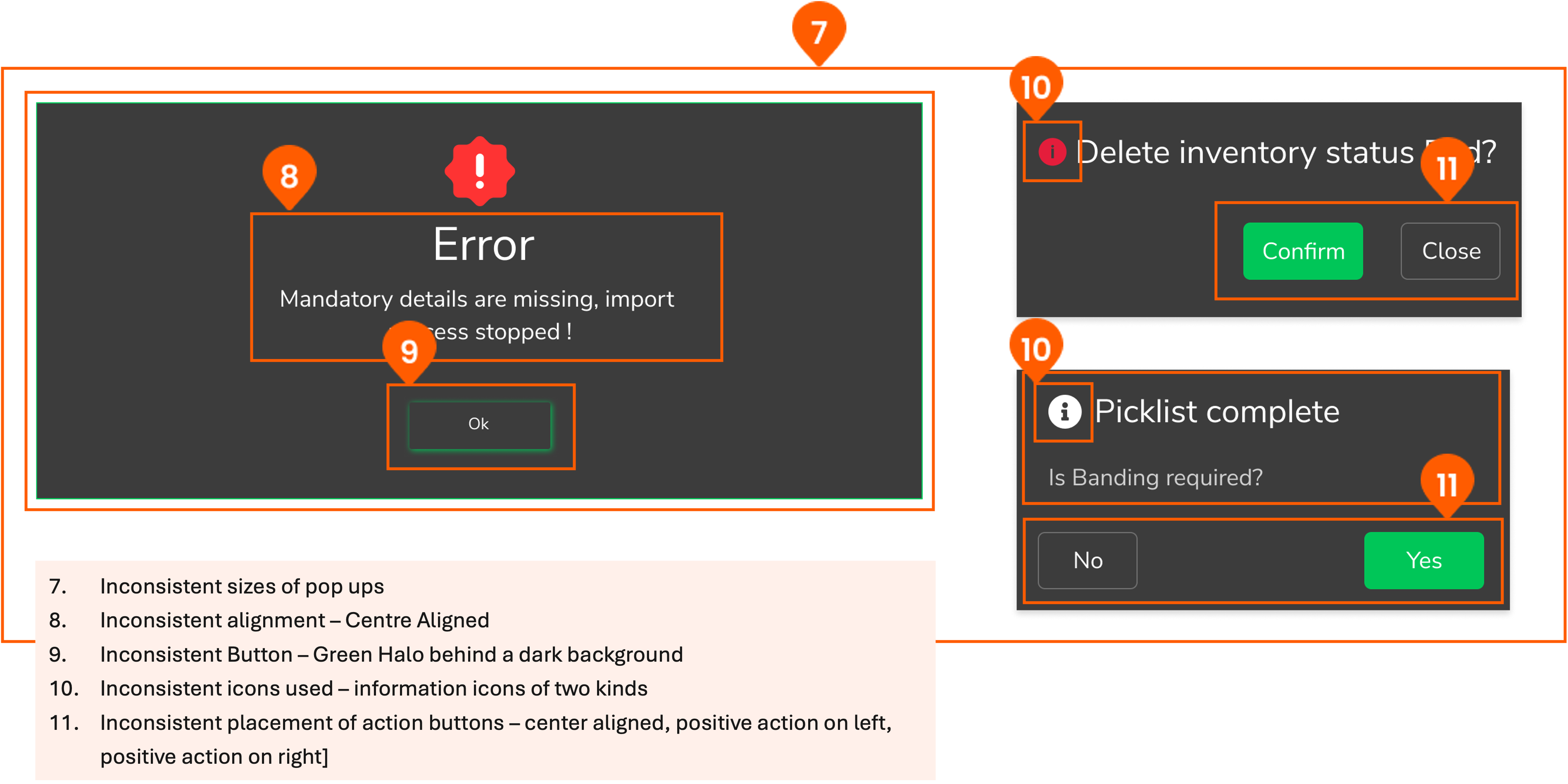
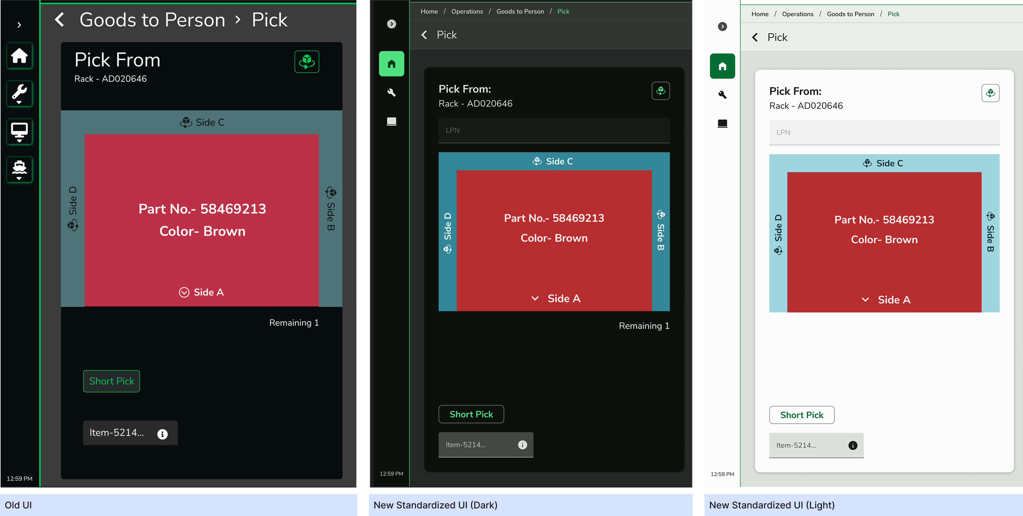
Old UI vs New Standardised UI
How We Built It
Why Not Use an Existing Design System?
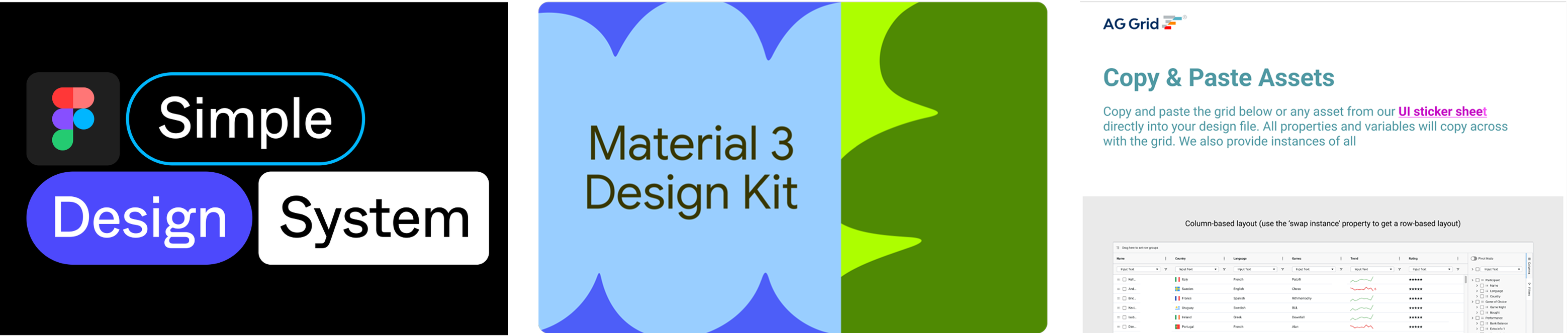
We explored using pre-existing design systems like Simple Design and Material Design but faced the following limitations:
- 1. Our development stack was based on Material 3 (M3) and AG Grid, requiring heavy customization.
- 2. As a niche WMS software, we needed specialized components that were not readily available in existing systems.
- 3. The extreme complexities of these readily available design systems on Figma further deterred us.
Our Process – How We Built It in Figma
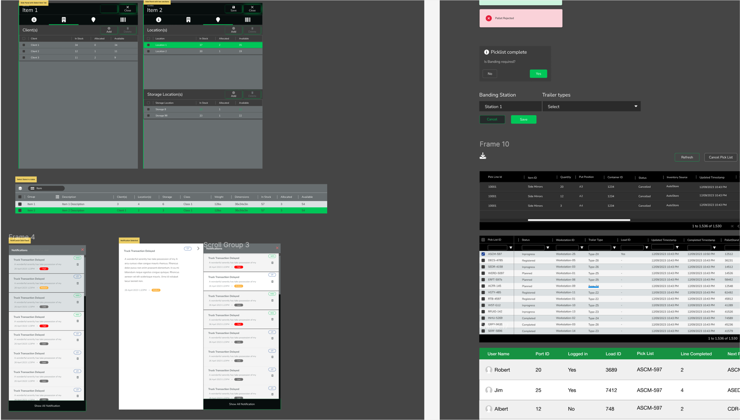
1. Created a Component List
We picked the unique components from each and every existing screen and grouped them into AG Grid, Material and Custom Components.
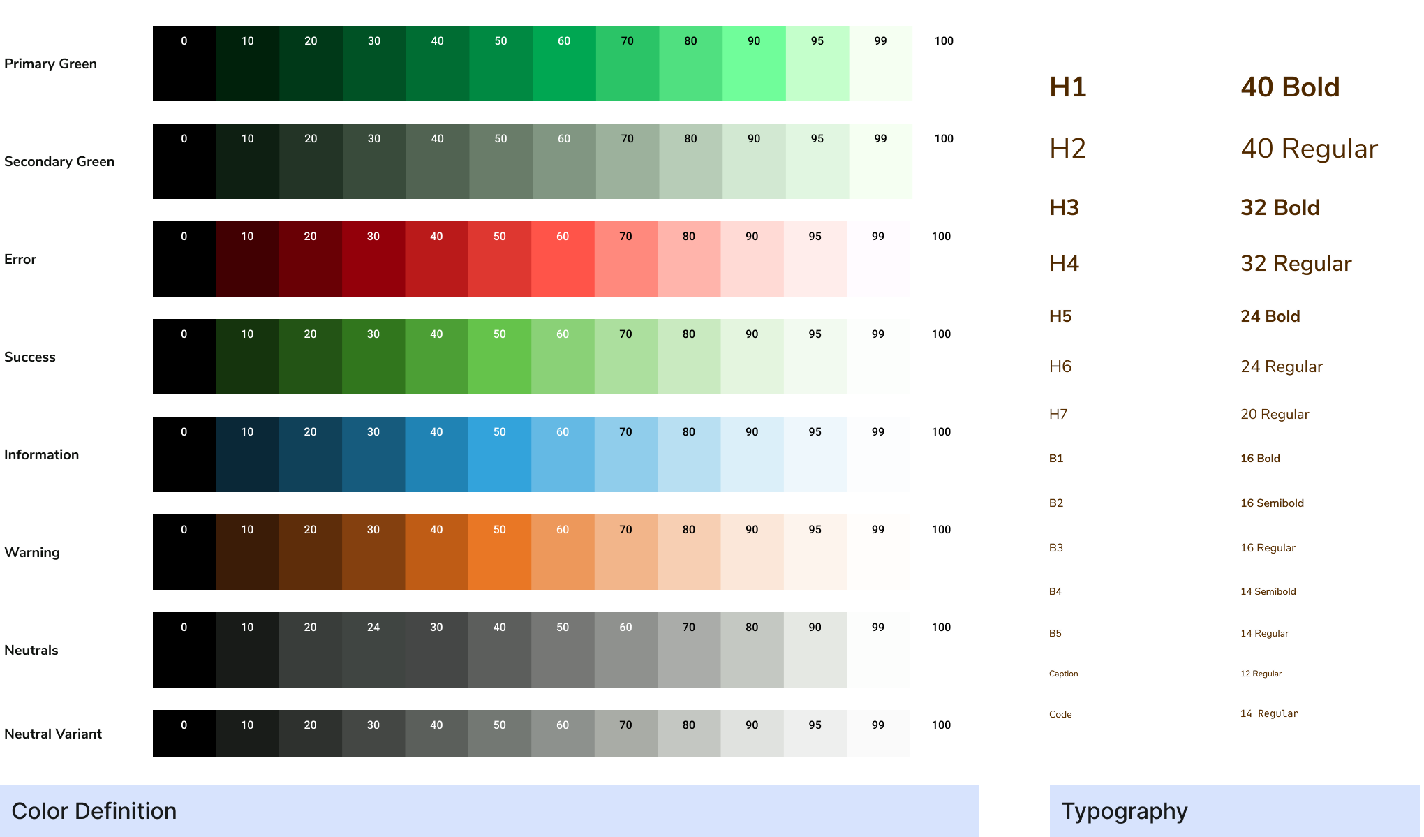
2. Color System, Typography Definition
We began by defining a foundational color palette and typography system, establishing clear guidelines for visual hierarchy, accessibility, and brand consistency.
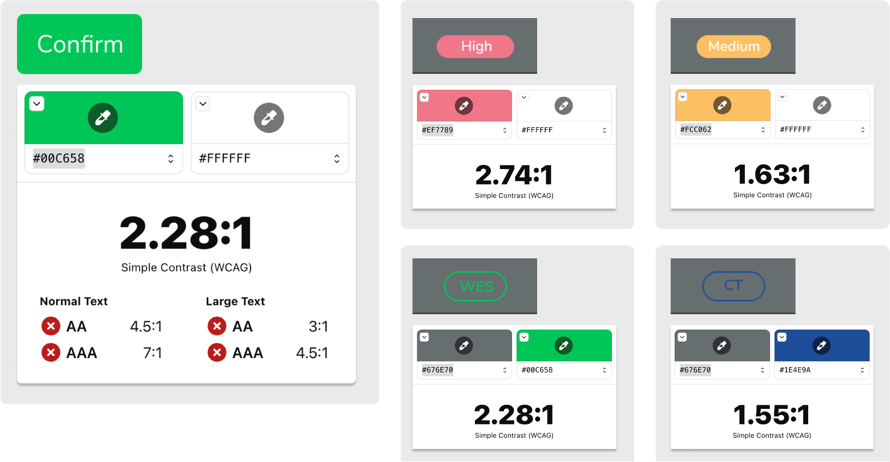
Next, we adapted the chosen colors into defined tokens for both light and dark modes. The process was iterative and occasionally messy, involving multiple rounds of testing and adjustments to ensure consistency, contrast, and usability across various UI components.
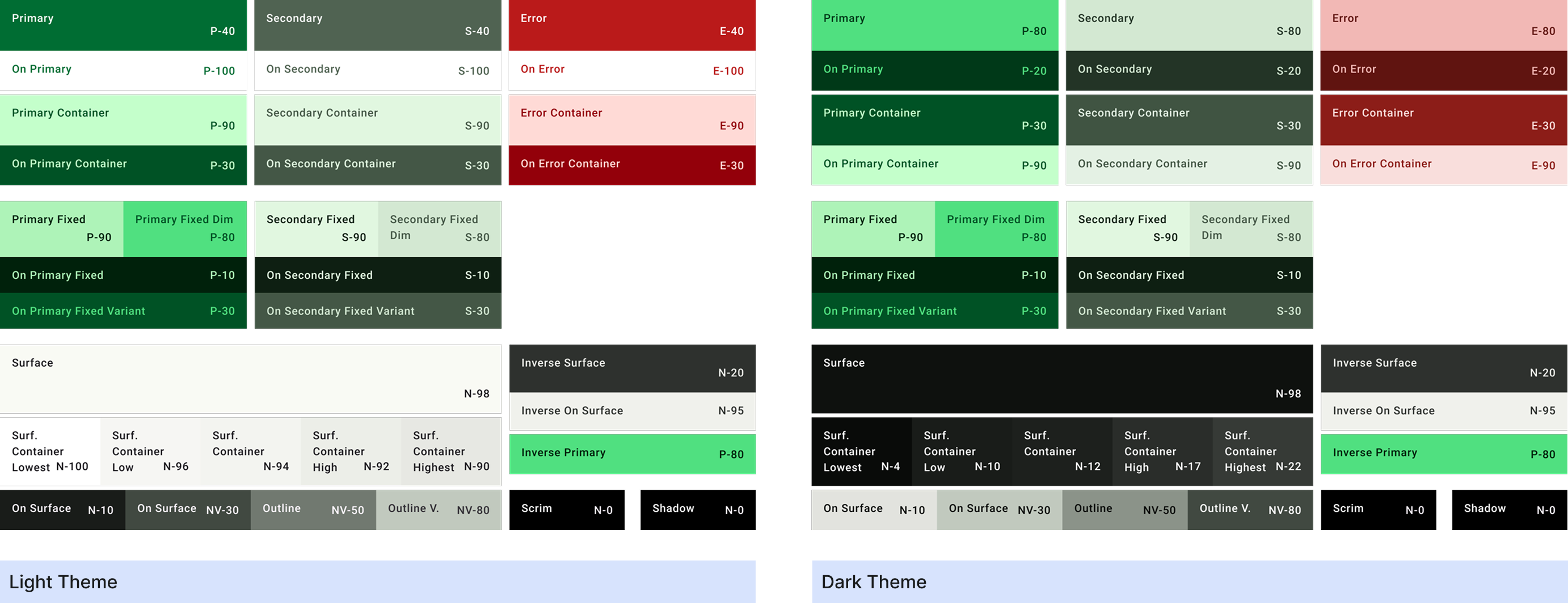
3. Dark & Light Mode Definition in Figma
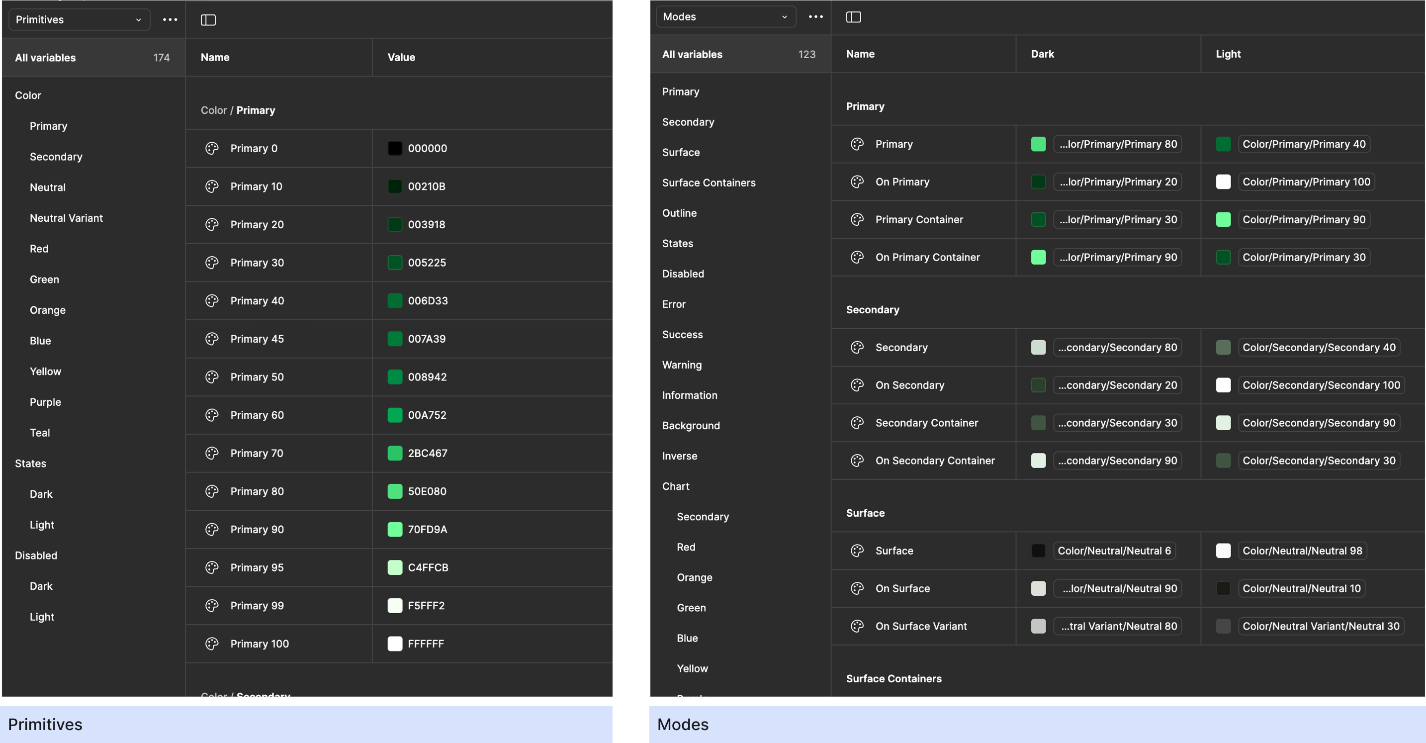
We started by creating a set of primitive colors and aliases tailored for both light and dark modes. Next, we ran contrast accessibility checks across combinations to ensure compliance and readability. Finally, we mapped colors systematically across modes to enable smooth switching between light and dark modes, ensuring a consistent and accessible experience throughout.
4. Component Creation
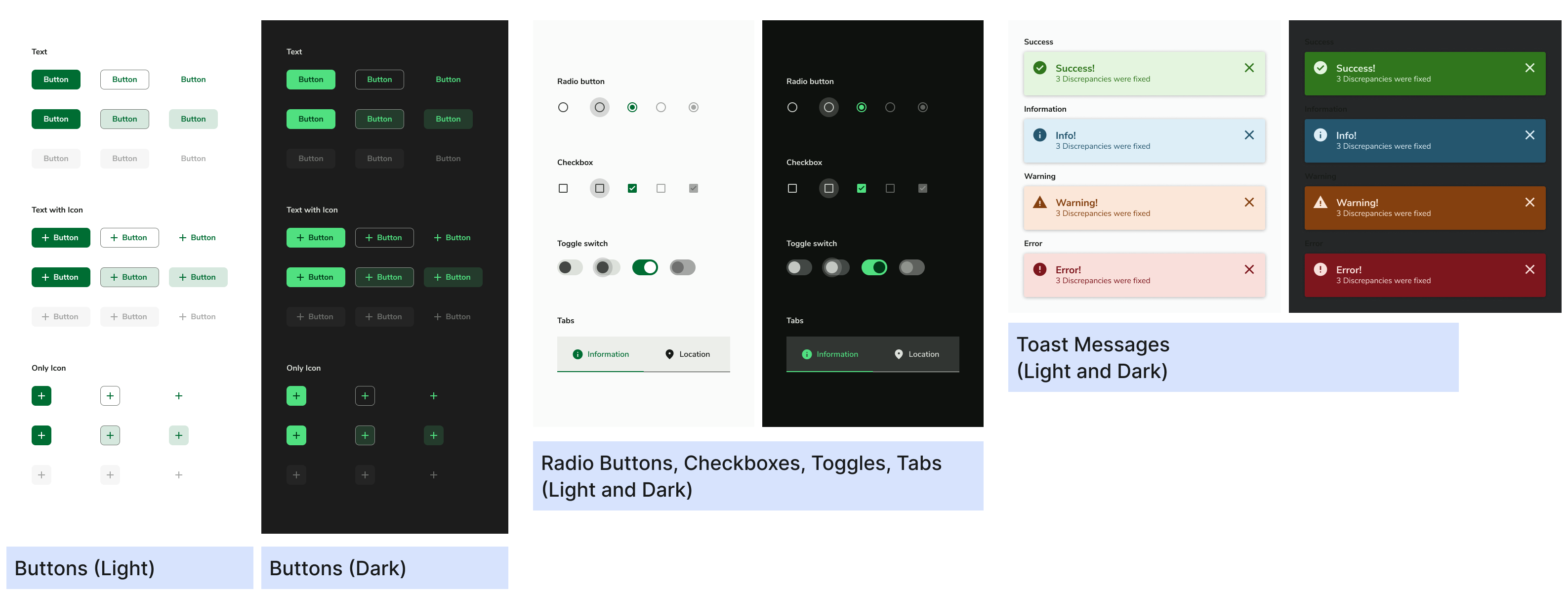
Based on M3 guidelines, we designed components with variants and states.
5. AG Grid Alignment
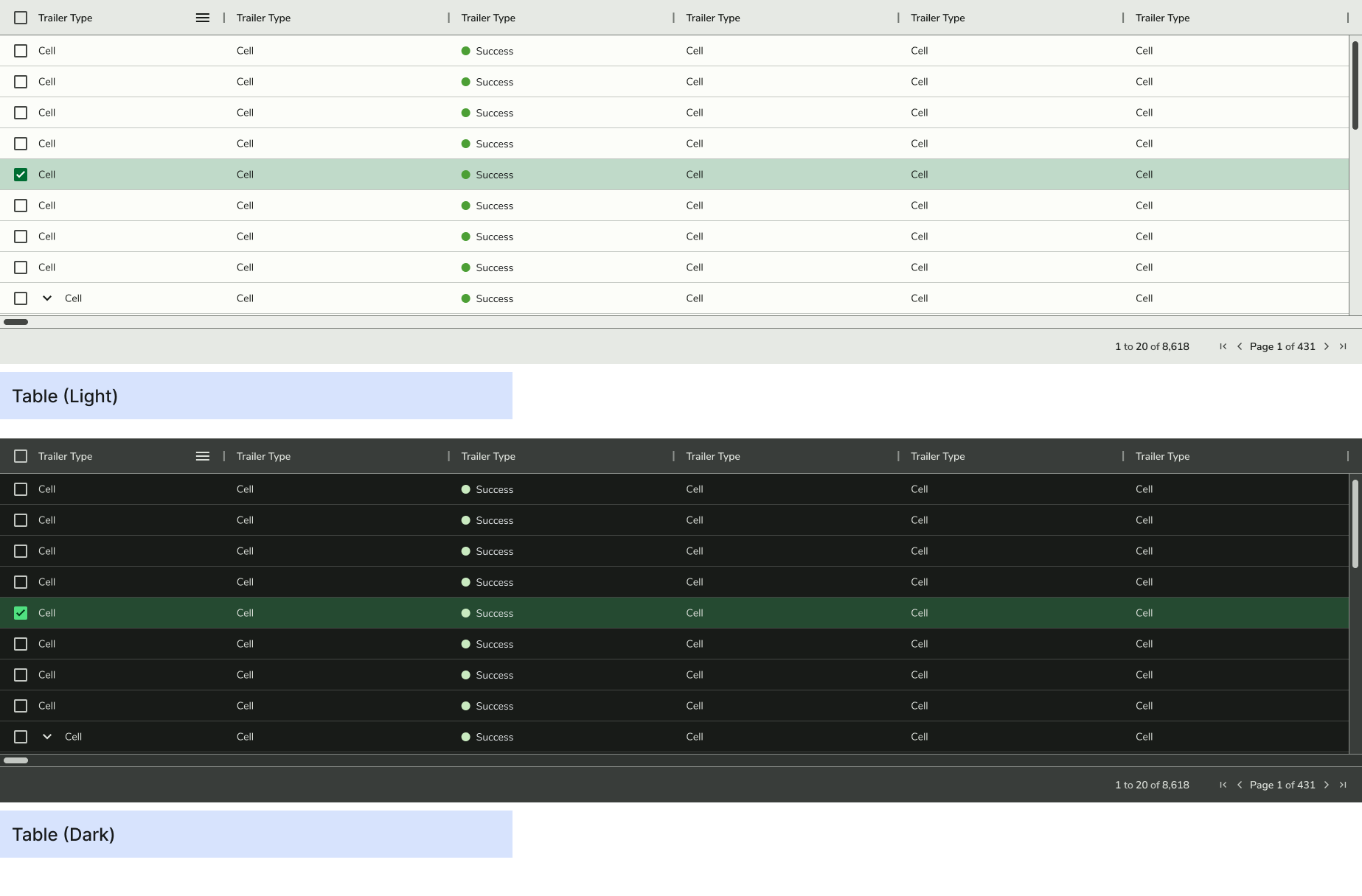
We initially explored using AG Grid's Figma file for table components but ultimately built our own for greater design flexibility. This gave us control over custom fields, states, and action buttons, enabling a more tailored experience for our workflows.
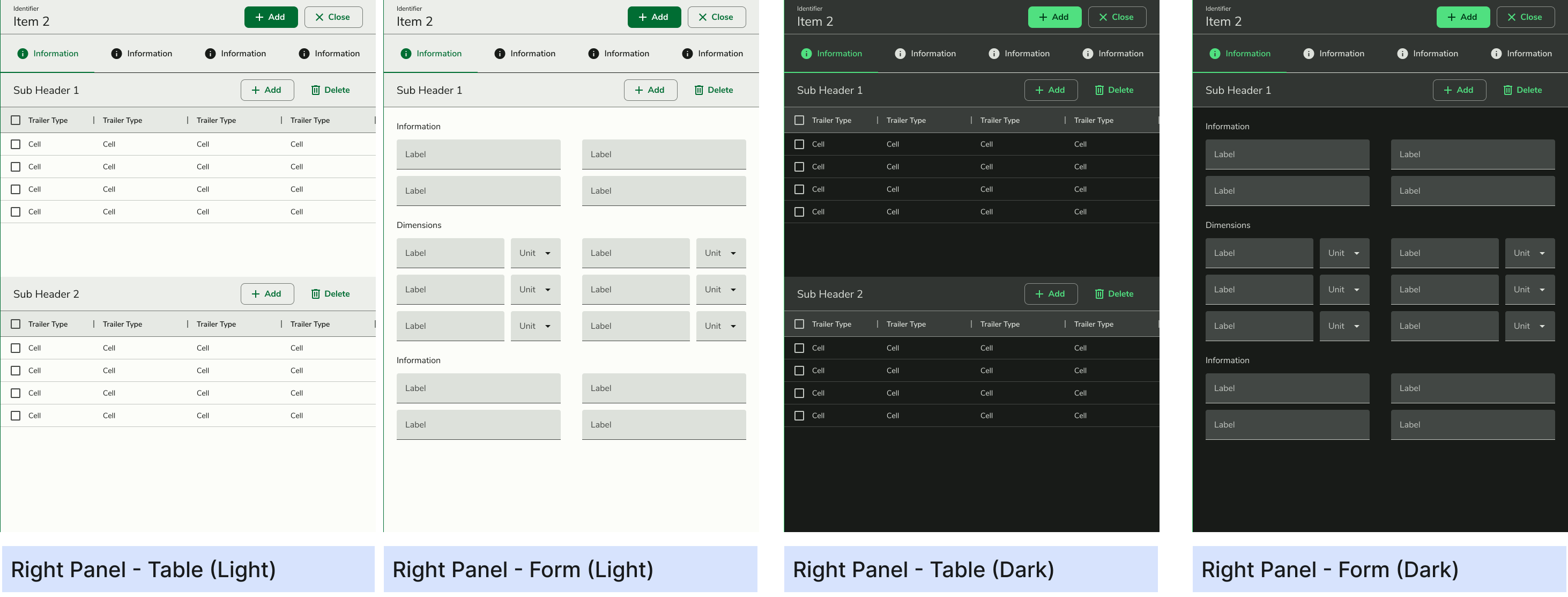
6. Right & Navigation Panel
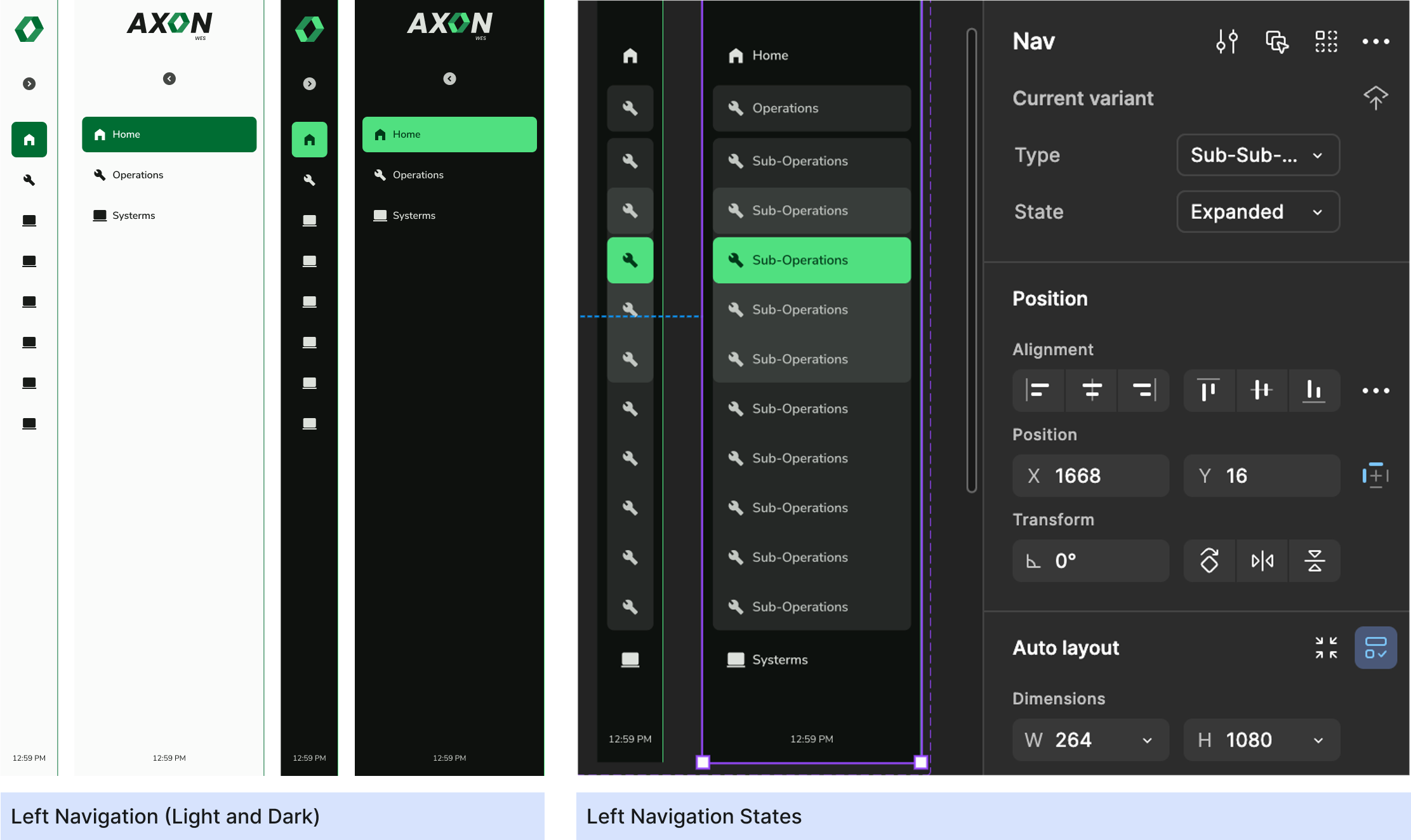
We designed a flexible left navigation panel to support multiple nested groups and a versatile right panel used extensively across screens for context-specific interactions.
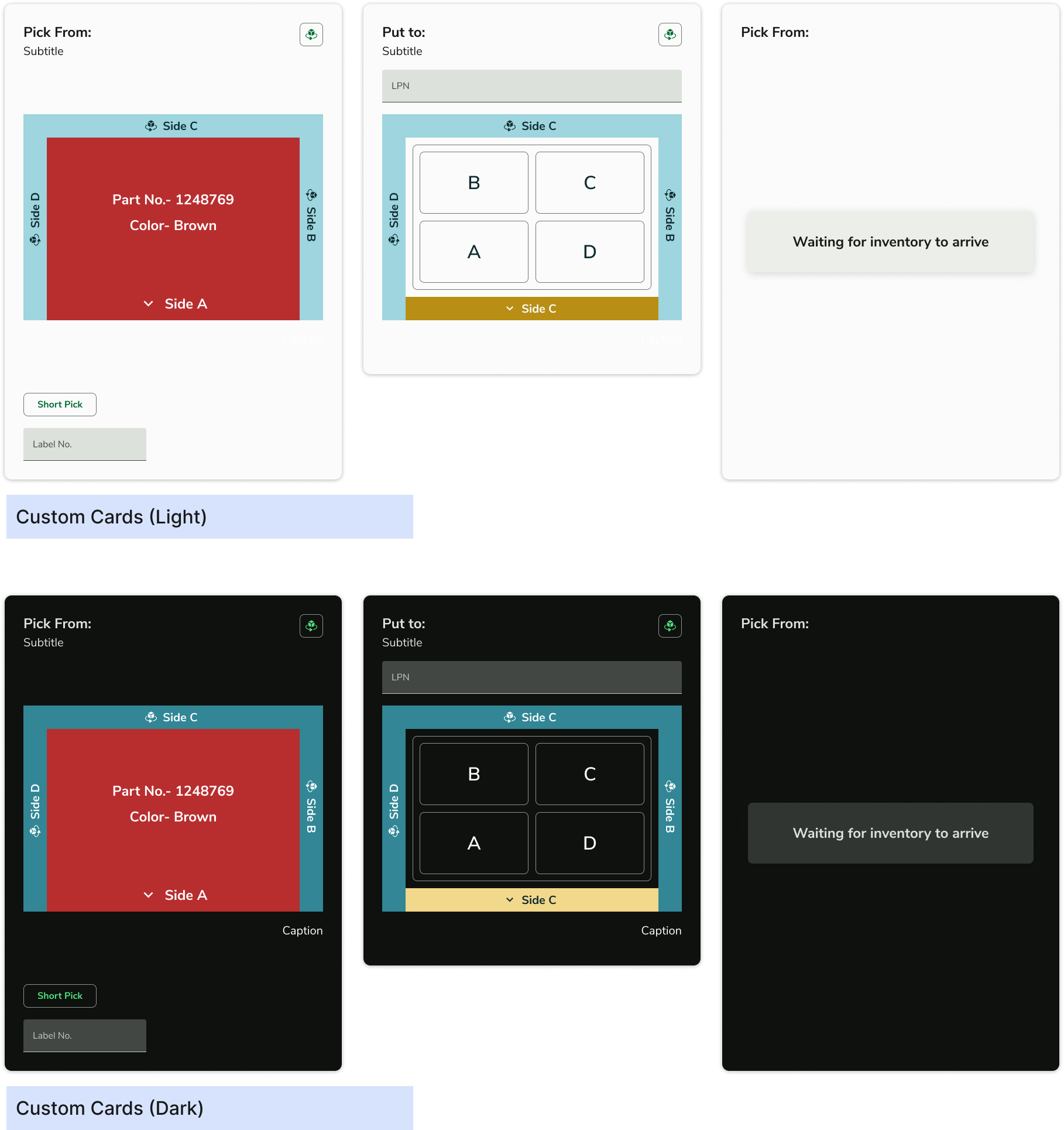
7. Custom Components
We created custom components to support WMS-specific workflows, with an emphasis on nested components to promote reusability—for example, smaller card components reused within more complex Picking Cards. We also created widgets for dashboard.
Design Systems for Different Products
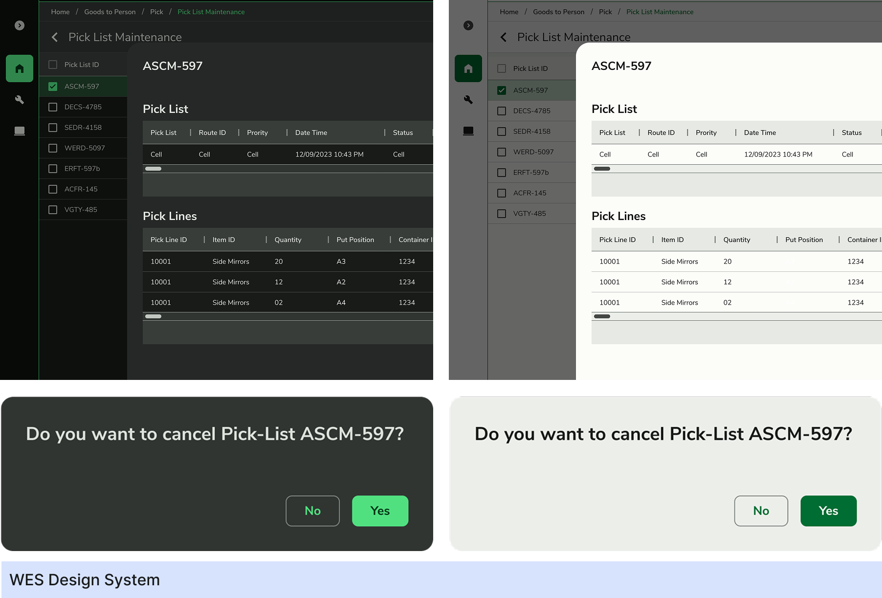
WES Design System
Once the WES design system was in place, we began recreating all legacy screens from the previous design team, which were originally in Adobe XD. Since the shift to Figma was necessary, we used this opportunity to rebuild the screens using systemized components.
This involved redesigning nearly 780 screens, ensuring alignment with the new system. The process took around four months, and significantly improved consistency, scalability, and collaboration across the product.
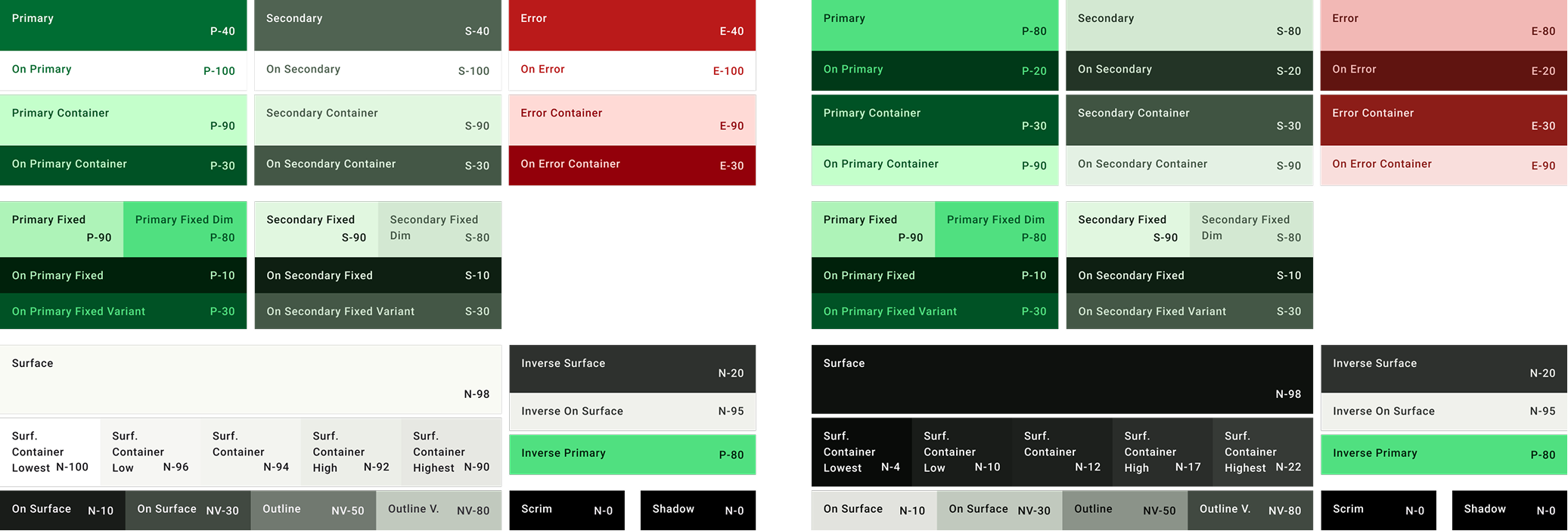
The Light and Dark Theme definition for the Variable System
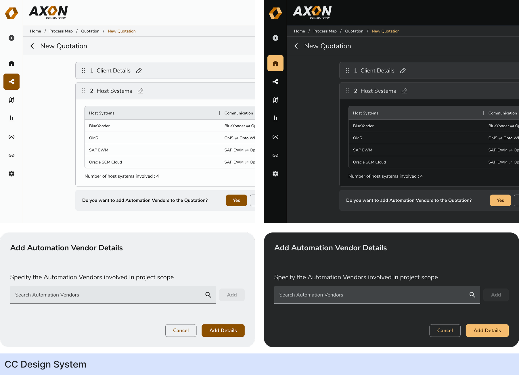
Control Tower Design System
For the Control Tower design system, we initially tried to extend the existing WES system by adding modes. However, since Control Tower was a new product with evolving needs, and WES had limited flexibility, this approach introduced unnecessary complexity.
We ultimately decided to build a separate design system, using the WES foundation where possible but allowing for incremental, product-specific improvements. This gave us the freedom to tailor the system to Control Tower's unique workflows while maintaining consistency across the broader platform.
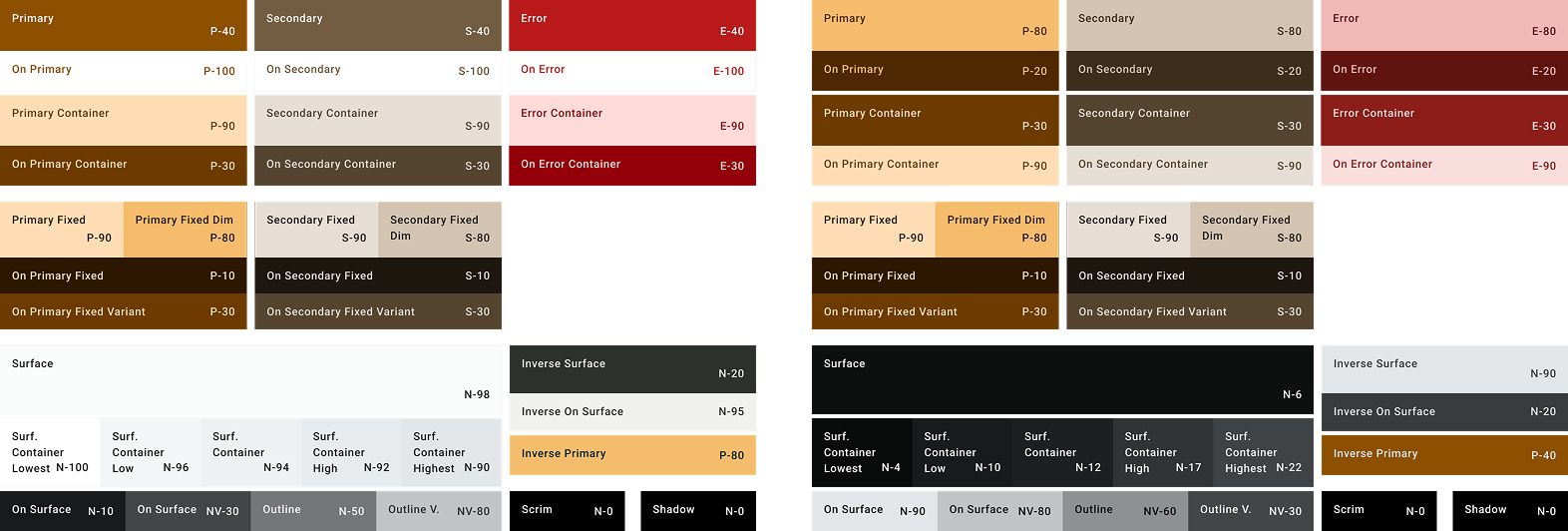
The Light and Dark Theme definition for the Variable System
Adoption and Aftermath
Adoption & Developer Collaboration
To ensure seamless adoption, we:
- 1. Conducted a demo call with developers to explain how to fetch colors and components.
- 2. Provided a JSON file export via Figma plugins.
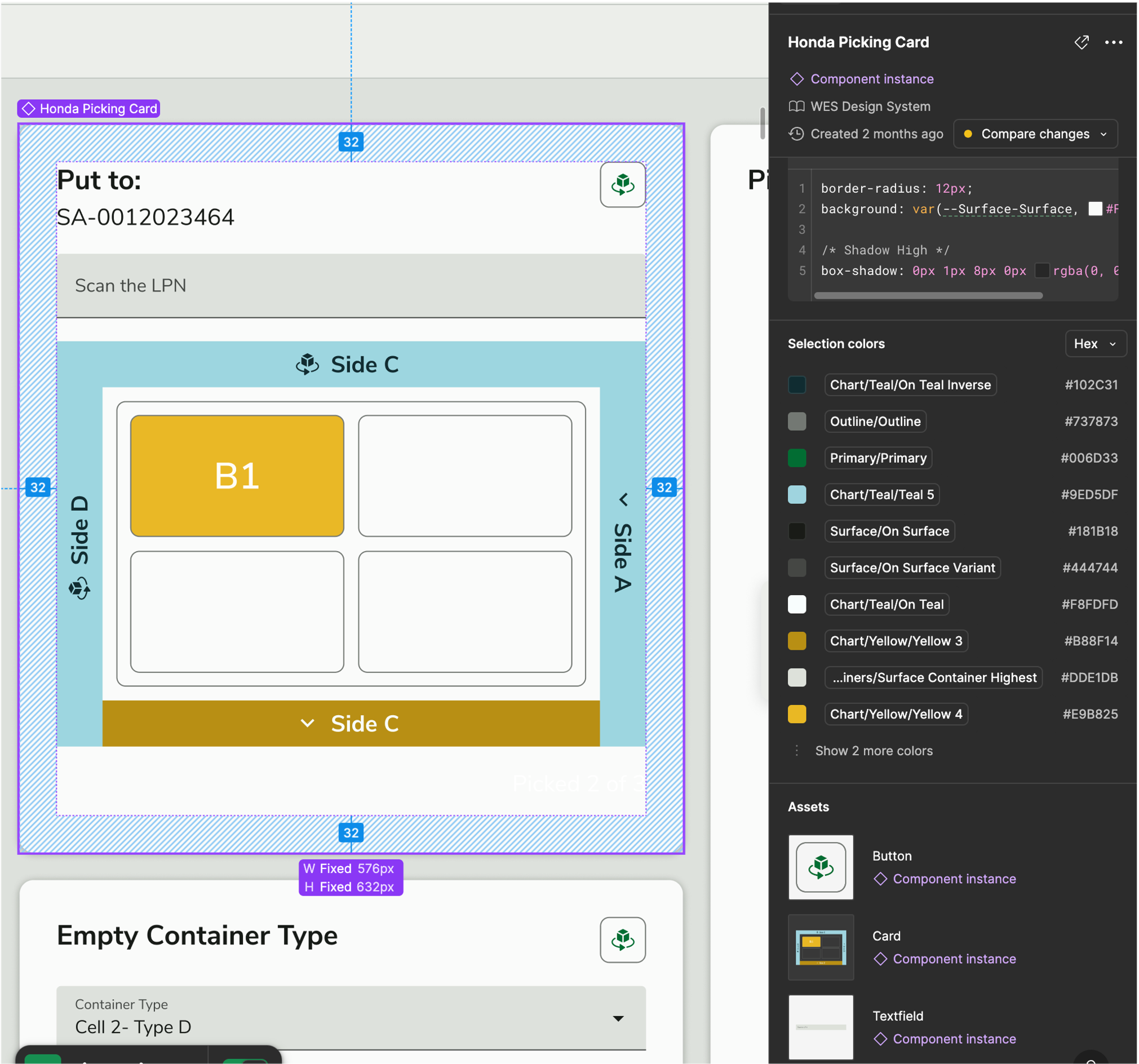
- 3. Developers primarily use the Dev Mode or local library or Figma inspect tool to access components.
Impact on Development Workflow:
- 1. Common elements like page headers with contextual action buttons are now modular, reducing redundancy.
- 2. Text fields were previously inconsistent; now, they are standardized, eliminating repetitive development work.
- 3. Colors, typography, components are all standardised and available in one place.
Developer Feedback
"Previously, we had to check for colors on every feature. Now, we can just define once."
"Components have all the states in one place, do not need to run the prototype every time."
"Can create the component library at one go, do not have to hunt for the components in every page."
Challenges & Key Learnings
We had limited internal familiarity with Figma's latest features, so we had to self-learn through trial and error. Since off-the-shelf component libraries didn't fit our needs, we had to build everything custom, which demanded extra time and attention to detail.
Figma's Dark & Light mode capabilities turned out to be a game changer, helping us cut design time by nearly 50%. Starting small, layer by layer, helped us stay organized and build a scalable, reliable design system without overwhelming the team.
Future Evolution & Scalability
- 1. We continue to update the design system as needed based on product changes.
- 2. We plan to modularize parts of the system so that future products can reuse core components instead of creating entirely new design systems.
- 3. Exploring better integration methods to streamline adoption across different products. Currently we have two different design systems as there were different interactions/custom components for each product.
By shifting from a project-based to a product-based approach, our design system has led to faster development, fewer errors, and a more scalable UI framework. While there were challenges, the impact on efficiency and maintainability has made this initiative a game changer for our team.